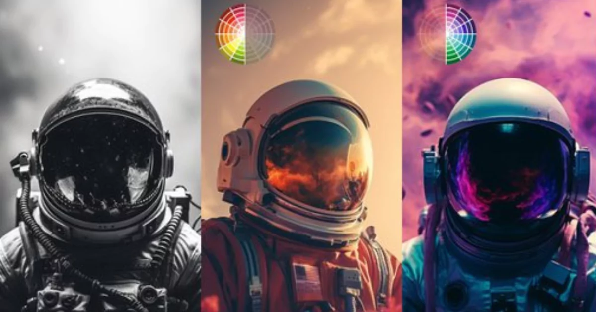
When generating images using Midjourney, the color palette is a crucial factor. Midjourney v6 enables you to use both basic and advanced color palette tokens.
This guide explores the world of basic color palettes in Midjourney, equipping you with the tools to paint your visions into a vibrant reality.
MidJourney v6 Color Theory:
Before diving into specific palettes, let’s brush up on some color theory basics:
Primary Colors: Red, Yellow, and Blue – the building blocks of all other colors.
Secondary Colors: Mixing primaries in equal parts creates Orange, Green, and Violet.
Tertiary Colors: Mixing primaries and secondaries creates even more hues like Red-Orange, Yellow-Green, etc.
Color Schemes: Different arrangements of colors evoke specific emotions:
Complementary: Opposites on the color wheel (e.g., Red & Green) create high contrast and vibrancy.
Analogous: Neighboring colors (e.g., Blue, Blue-Green, Green) provide harmony and flow.
Triadic: Three equidistant colors (e.g., Red, Blue, Yellow) create bold dynamism.
Pre-Built Palettes in MidJourney:
Midjourney offers a selection of pre-built palettes to jumpstart your creativity:
- Basic Colors: White, Black, Brown, and Grays – the foundation for any palette.
- Extended Colors: Tan, Beige, Blush, Scarlet – adding variety and nuance.
- Dark/Light Variations: Darker/lighter versions of existing colors for tonal control.
- Vivid Variations: Amplified versions of colors for added intensity.
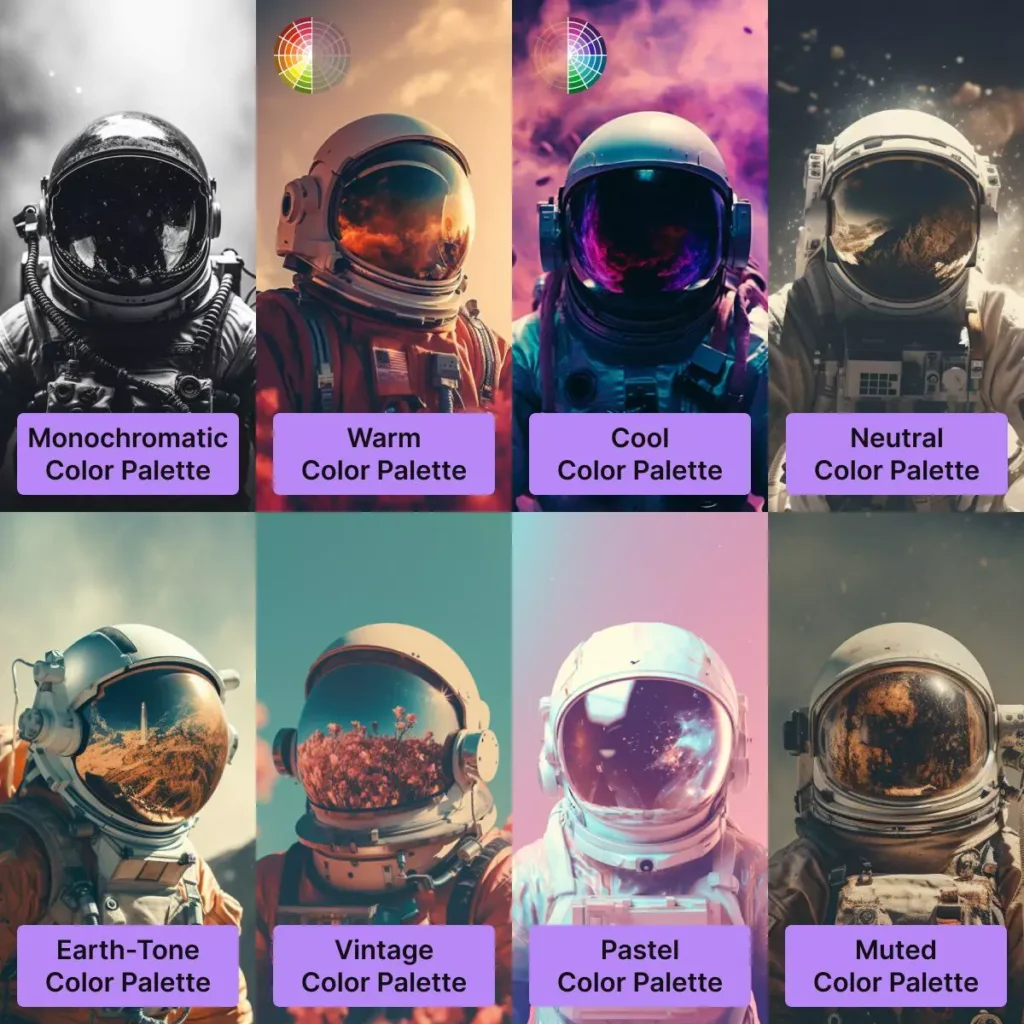
MidJourney v6 Basic Color Palettes List
1. Monochromatic: Built upon a single hue and its variations, this creates a unified and elegant feel. Use keywords like “monochromatic blue” or “monochromatic green” to experiment.
2. Warm: It defines energy, passion, and optimism. You can use terms like “warm sunset colors” or “warm desert palette” for vibrant results.
3. Cool: Inspires calmness, serenity, and peace. Try “cool ocean tones” or “cool moonlight palette” for a tranquil atmosphere.
4. Neutral: Offers a subtle and balanced foundation. Explore “neutral beige palette” or “neutral gray tones” for versatility.
5. Earth-Tone: Captures the natural world’s richness. Experiment with “earth-tone landscape palette” or “earthy browns and greens” for grounding compositions.
6. Vintage: Explore “vintage poster palette” or “pastel vintage hues” for a touch of history.
7. Pastel: Exudes softness, tenderness, and whimsy. Try “pastel rainbow palette” or “muted pastel tones” for a dreamlike feel.
8. Muted: Provides a subdued and contemplative quality. Experiment with “muted jewel tones” or “low-saturation landscape palette”.
Crafting Your Palette:
While convenient, these pre-built options are just the beginning. To truly personalize your artwork, craft your own palettes using descriptive keywords:
- Colors: Mention specific hues or color names (e.g., “ocean blue,” “burnt orange”).
- Mood: Describe the desired atmosphere (e.g., “pastel and soft,” “vibrant and energetic”).
- Reference Images: Upload images with color schemes you like for MidJourney to analyze.
Examples:
- “A cyberpunk scene with neon colors like blues, purples, and pinks.”
- “A sunset landscape with warm hues of orange, red, and yellow transitioning to soft purples and blues.”
- “A vintage poster with muted and desaturated colors like teal, ochre, and olive green.”
Basic Color Palette Quick Overview
Color Balance: Use keywords like “warm,” “cool,” or “contrast” to manipulate the overall temperature and balance.
Harmony: Strive for color harmony by considering analogous or complementary schemes.
Saturation: Control the intensity of colors with terms like “saturated,” “muted,” or “pastel.”
Value: Use “light,” “dark,” or “high contrast” to adjust the brightness and value relationships.
MidJourney Colors list:
- Apricot
- Aqua
- Ash Gray
- Auburn
- Baby Blue
- Baby Pink
- Beige
- Black
- Black and White
- Black Bean
- Black Olive
- Blonde
- Blood Red
- Blue Violet
- Blush
- Bordo
- Bright Bold Colors
- Bronze
- Brunette
- Buff
- Burgundy
- Burnt Amber
- Burnt Sienna
- Canary Yellow
- Candy Colors
- Cerulean Blue
- Chartreuse
- Chestnut
- Chinese Violet
- Cinnamon
- Cobalt Blue
- Cold Colors
- Cool Colors
- Cooper
- Coral
- Cornflower Blue
- Cotton Candy Colors
- Crimson
- Cyan
- Danish Pastel Colors
- Dark Green
- Dark Orange
- Dark Pink
- Dark Pink Colors
- Dark Purple
- Dark Red
- Dark Vibrant Colors
- Dark Violet
- Desaturated
- Ecru
- Electric Blue
- Electric Colors
- Electric Indigo
- Electric Purple
- Flax
- Forest Green
- Frost Colors
- Fuchsia
- Golden Yellow
- Gradient Colors
- Graph
- Gummy Colors
- Gunmetal Gray
- Hot Colors
- Hot Pink
- Hunter Green
- Indigo
- Ivory
- Kelly Green
- Khaki
- Lavender Blush
- Lemon Yellow
- Light Green
- Light Pink Colors
- Lime
- Linen
- Magenta
- Mahogany
- Marigold
- Maroon
- Mauve
- Midnight Blue
- Millennial Pink
- Mint
- Mocha
- Muted Colors
- Navajo White
- Navy Blue
- Neon Colors
- Neon Green
- Neon Orange
- Neon Pink
- Neutral Colors
- Olive
- Orange
- Orange Red
- Pastel Colors
- Pastel Green
- Pastel Orange
- Pastel Pink
- Payne’s Gray
- Peach
- Persimmon
- Pink
- Platinum
- Plum
- Prussian Blue
- Raisin
- Red
- Red Copper
- Retro Colors
- Rich Colors
- Rouge
- Royal Blue
- Russian Violet
- Rustic Colors
- Saffron Yellow
- Salmon
- Scarlet
- Sepia
- Sienna
- Silver
- Sky Blue
- Slate Gray
- Smoky Black
- Snow White
- Spectrum Colors
- Spring Green
- Sweet Colors
- Tan
- Tangerine
- Taupe
- Tawny
- Tea Color
- Teal
- Technicolor
- Tropical Colors
- True Blue
- Turquoise
- Vantablack
- Vibrant Colors
- Vibrant Holographic Gradient
- Vintage Colors
- Violet
- Warm Colors
- Watermelon
- White
- Yellow Green
- 10 Midjourney V8 Tips to Enhance Your Results Fast | Prompting, SREF codes

- Midjourney v8 vs Nano Banana 2 vs Seedream 5.0 Lite
- How to Personalize Your Midjourney Profile: Beginner to Advanced Guide
- Midjourney V8 ALPHA: Key Insights, Challenges, and Upcoming Features

Demi Franco, a BTech in AI from CQUniversity, is a passionate writer focused on AI. She crafts insightful articles and blog posts that make complex AI topics accessible and engaging.